Modern text decoration with CSS box-decoration-break
I recently stumbled across the hey.com website and noticed the cool highlight effect they use for quotes.
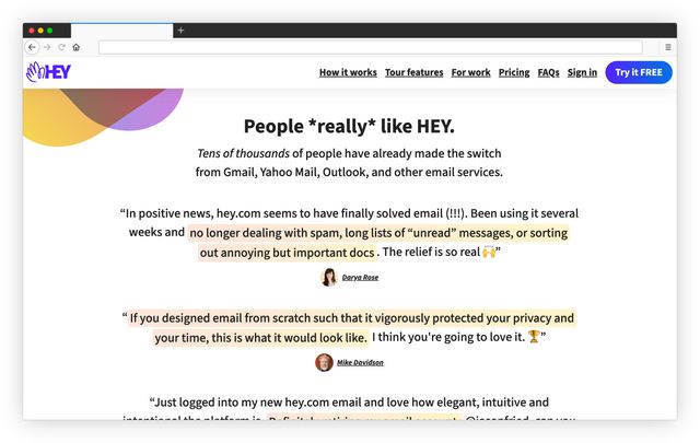
The effect got my attention because they decorated text across multiple lines. To be honest, I didn't know how to do it, so I did some research and came up with my own solution for a simple yet beautiful card.
The trick is the CSS property box-decoration-break. It lets you clone some CSS properties, like the background or the border, to every line of the text (see MDN for details).
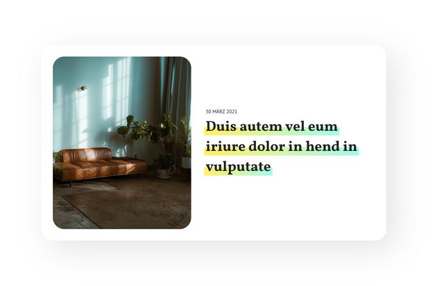
In my example above, I used a linear gradient and combined it with some background sizing and positioning to highlight only half of the text:
.card__title {
  font-family: 'Vollkorn', serif;
  font-size: 40px;
  line-height: 1.4;
  color: #222022;
  box-decoration-break: clone;
  background-image: linear-gradient(90deg, #ffef7e, #b7f9e9);
  background-size: 100% 42%;
  background-repeat: no-repeat;
  background-position: 0 85%;
  padding: 0 4px;
  margin-left: -4px;
}
The whole example is available on Codepen.
Have fun adding some extra sparkles to your website 💅🏽